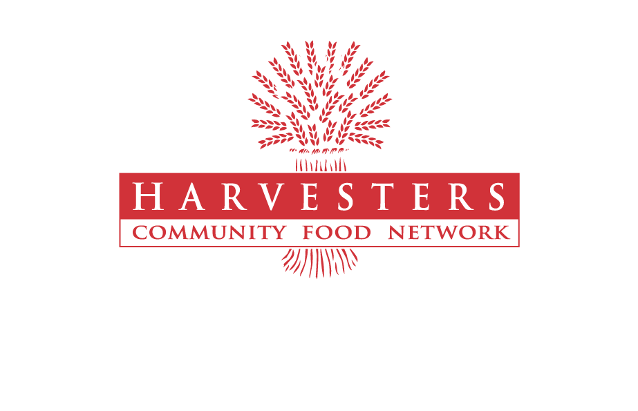
The logo is our signature. It represents our identity and we must adhere to certain standards when we use it. The logo must be displayed following all guidelines listed below.
If you have questions about using Harvesters’ logo, please email Kelly. For any groups or organizations using our logo on marketing materials, the Communications Department needs to approve piece prior to publication.
Logo Guidelines
In order to preserve legibility, the logo should never be displayed on any material at a size smaller than 1 3/8” in width. When the logo is smaller than this, the type in the bar becomes illegible.
Do not alter the proportions of the logo when resizing. To ensure that proportions remain consistent, hold down the SHIFT key while you increase or decrease the size of the logo.
Do not place the logotype on a background that affects its legibility. Always respect the isolation zone. The isolation zone is the area surrounding the logo in which other graphics should not reside.
Do not alter the color, layout, or modify existing elements of the logo. Do not add any additional elements to the logo. Do not alter the copy or font within the logo.